Data visualisation is a powerful form of storytelling that uses complex statistical information as to its substrate. More than one tale can be told from this dense raw material – some accurate, some misleading, some useful, and others not so much.
By mastering the art of data visualisation, you unlock the ability to tell stories that are accurate, easy to understand, and useful for your target audience. With the right graphics, you can communicate complex information in seconds.
While it helps to work with the best data visualisation tools, the most important factor is you and your choices in presenting the data. At Alphalake Ai, we spend a lot of time developing and honing data visualisation best practices, so we thought we’d share some of the common errors and improvements we’ve come across in a series of quick tips.
Check out the first one below and follow us to see the full series.
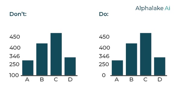
Zero is the ideal baseline
Where possible, always start from zero as it usually gives the ideal context for comparison. Exception: a truncated scale can work if you need to highlight small fluctuations in data. However, you should never start from a value other than 0 without a justifiable reason.
Choose the right chart for the story you’re telling
There are many ways to tell a story with data, so it’s essential to select a visualisation that doesn’t demand too much work from the reader. For example, a grouped bar chart may work for one data set but create confusion with another. Whichever option you go for, ensure visual consistency so your audience can compare each element at a glance.
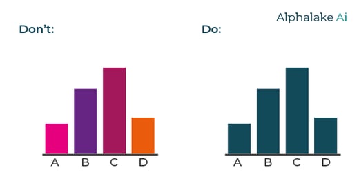
Use colour to your advantage with data visualisation
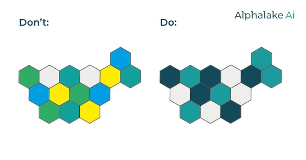
Never use colour randomly in data visualisation. This only creates confusion as readers will be looking for a pattern that’s not there. Instead, use colour to a group and differentiate data sets or highlight points of focus.
.png?width=602&name=Asset%209%20(1).png)
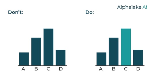
Help the reader find key information
Data visualisation is all about making complex information consumable for your audience. So, it’s worth looking for simple ways to highlight the key takeaways. This can be done with labels and other elements. However, it’s important to avoid creating distractions. Sometimes, a simple change of colour is the ideal way to draw attention to a salient point.
Avoid colour confusion
Use your intuition when selecting colour intensity for values (red hits differently from blue, and bold colours hit differently from pastels). While you should avoid using too many colours in a single layout, you must ensure the reader can easily differentiate the shades in your colour scale.
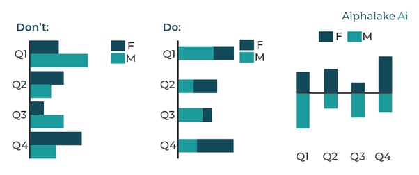
Randomness is the enemy of clear data visualisation
It’s always worth taking a step back to consider the order in which you’re presenting your data. For example, a comparative bar chart in which the independent variables do not need to go in a certain order may improve the readability to arrange the bars in ascending or descending order.
.png?width=443&name=Asset%20600%20(1).png)
Tell every level of the story
Data generally has more than one story to tell, and those stories become more profound when we place them in the right context. One of the simplest yet most effective ways to create context and tell every level of a story is to combine different chart types into a single visualisation.
Creating context vs creating distractions
Succinct and well-placed callouts are a great way to highlight a point the reader may otherwise have missed. However, it’s essential to keep text and other non-essential elements to a minimum as it doesn’t take much to make your chart feel cluttered and confusing.
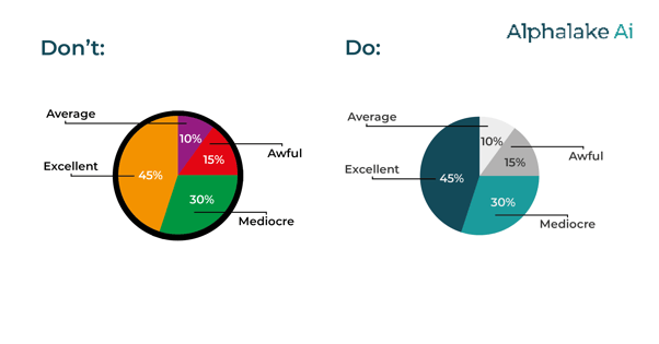
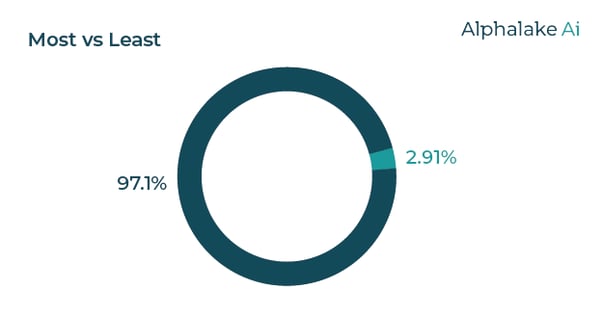
Mastering the art of the pie chart
A well-constructed pie chart can instantly understand the various parts of a whole. However, they can quickly get confusing if not managed correctly. The best practice is to limit the number of sections to 5 (though you can get away with 6 or 7). Label directly on the chart as legends demands extra work from the reader, which is the main thing you wish to avoid with data visualisation.
Work with colour palettes
If you’ve been following the series, you’ll have picked up how important colour is to data visualisation. Thankfully, there are some established colour palettes you can use to perfect your visualisations. Even if you’re using colours to match your branding, these palettes can help you select the right shades to represent different data sets.
✅ A qualitative colour palette is ideal for categorical data as it allows you to create clear distinctions.
✅ A sequential colour palette works best for numerical data that needs to be placed in ascending or descending.
✅ A divergent colour palette is ideal for visualisations with positive and negative values as it gives you a central zero point.

Image from Plotly


.jpg)